
Great American Coffee Test
Around 4000 People with variable background were served 4 different Coffee
Learn moreConsumer complaints on financial products & services for Bank of America from 2017 to 2023
In the 2017-2023 period there were many complaints from customers regarding Bank of America's financial products and services covering many aspects. From this case we will analyze and look for answers to the following questions:
To solve the problem, Dataset created in Microsoft Excel from Maven Analytics will be used to provide concrete answers. Here Pandas will also be used for data search and data visualization.
Let's get started. The first thing we need to do is we have to install the resources we need such as Pandas for analyzing data & MatPlotLib and Seaborn for data visualization
import pandas as pd
import matplotlib.pyplot as plt
import seaborn as sns
after that we have to download the dataset from Maven Analytics and export it to Jupyter Notebook
file = pd.read_csv(Data/complaints.csv')
Then we have to clean the data. Here i have dropped duplicates and delete every data whose complaints does not have sub-product in it (sub-product is NULL), because every product should have sub-products
file = file.drop_duplicates() # dropping duplicates
file = file.dropna(subset=['Sub-product']) # deleting data without sub-product
Its aims are to make the data uniform and prevent us from errors that might occur due to the diversity of the data. For example, I have set the date data to the same format
file['Date submitted'] = pd.to_datetime(file['Date submitted'])
file['Date received'] = pd.to_datetime(file['Date received'])
Here we need to look at the number of complaints each year and search the average in order to analyze this question
file['Year'] = file['Date submitted'].dt.year # Extracting Years from column 'Date submitted'
yearly_complaints = file.groupby('Year')['Complaint ID'].count() # Count the number of complaints each year
avg_complaints = yearly_complaints.mean() # Searching average

# Visualizing data
plt.figure(figsize=(15, 8))
yearly_complaints.plot(marker='o')
plt.title('Seasonal Complaint Trends')
plt.xlabel('Year')
plt.ylabel('Number of Complaints')
plt.grid(True)
plt.show()
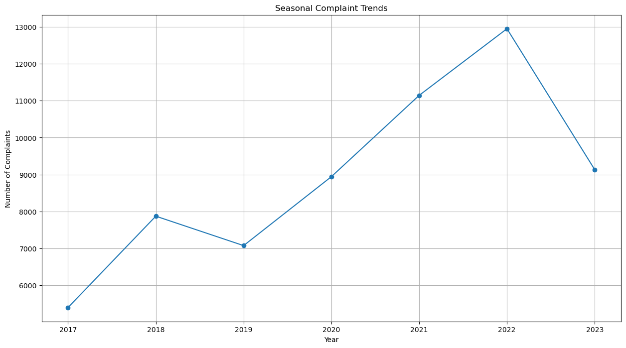
The pattern we can see here is that the highest number of complaints is in 2022, the lowest in 2017 and average on 8929 complaints each year. Furthermore, There is a consistent increase from 2019-2022. This indicates that there is a serious problem on the company side. Most likely it lies in the service and products offered. It is true that in 2023 the number of complaints have been decreasing, but compared to previous years, the number of complaints is still relatively high. Even so, this indicates that there have been improvements to the existing system, perhaps starting from the service system, products or policies. Consumer behavior may also be very influential in reducing the number of complaints. It should be noted that the strategy currently used by the company should be maintained and always reviewed so that the number of complaints continues to decrease and customers are always satisfied with the products offered.
Then we also need to look at complaint trends based on the products offered by the company to see what products need to be reviewed.
result = file.groupby([file['Date submitted'].dt.year, 'Product']).size() # Calculate the number of complaints for each year and product combination
result = result.reset_index(name='Total Complaints') # Reset the index to be able to use its columns in the plot

# Visualizing data
plt.figure(figsize=(18, 13))
for product, data in result.groupby('Product'):
plt.plot(data['Date submitted'], data['Total Complaints'], marker='o', label=product)

plt.title('Seasonal Complaint Trends by Product')
plt.xlabel('Year')
plt.ylabel('Total Complaints')
plt.legend()
plt.grid(True)
plt.show()
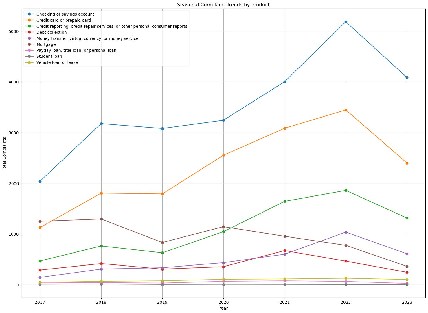
From the graph above, it can be seen that the number of complaints per product each year was quite stable and even tends to decrease in 2018-2019, then increased rapidly in 2020-2022, except for "Mortgage" and "Debt Collection" products. And in 2023, all products will show a significant decline. 2 products that need special attention in this case are "Checking or savings account" and "Credit Card or Prepaid Card". It can be seen that there are a lot of customers who use this product, so product quality and service speed need to be improved so that customer comfort is guaranteed.
Here we have to calculate the total complaints from each product and look for the problems that most frequently arise from each product. Here I will write the syntax to find the product with the highest total complaints and the problems that occur most frequently in each product.
# Product with most complaints
product_complaints = file.groupby('Product').size() # Count the number of complaints for each product

# Visualizing data
plt.figure(figsize=(22, 8))

sorted_products = product_complaints.sort_values(ascending=False)

bars = plt.bar(range(len(sorted_products)), sorted_products.values, color=plt.cm.get_cmap('Pastel1')(range(len(sorted_products))))

plt.title('Total Complaints by Product')
plt.xlabel('Product')
plt.ylabel('Total Complaints')
plt.xticks([])
plt.grid(False)

for bar, value in zip(bars, sorted_products.values):
    plt.text(bar.get_x() + bar.get_width()/2, value + 0.1, str(value), ha='center', va='bottom')

plt.legend(bars, sorted_products.index, title='Product')

plt.show()
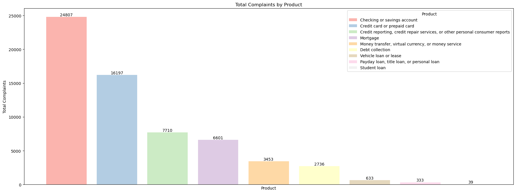
Here you can see that the product with the highest complaints is "Checking or savings account" while the lowest is "Student loan". For products with the highest complaints, companies need to review the product starting from the services offered, programs and services.
Then we will see what problems customers often complain about with a product
# Most common issues
product_issue_counts = file.groupby(['Product', 'Issue']).size().reset_index(name='Count') # Calculate the number of complaints for each combination of product and problem
top_issue_per_product = product_issue_counts.sort_values(['Product', 'Count'], ascending=[True, False])
top_issue_per_product = top_issue_per_product.groupby('Product').head(1).reset_index(drop=True)

# Visualizing data
plt.figure(figsize=(14, 8))

unique_combinations = top_issue_per_product[['Product', 'Issue']].apply(lambda x: f"{x['Product']} <=> {x['Issue']}", axis=1)
colors = plt.cm.tab20(range(len(unique_products)))
legend_handles = []

for i, product in enumerate(unique_products):
    product_data = top_issue_per_product[top_issue_per_product['Product'] == product]
    bars = plt.bar(product_data['Issue'], product_data['Count'], color=colors[i])
    legend_handles.append(bars[0])

plt.title('Most Common Issue for Each Product')
plt.xlabel('Count of Issues')
plt.ylabel('Number of Complaints')
plt.xticks([])

plt.legend(legend_handles, unique_combinations, title='Product <=> Most Issues')

for index, value in enumerate(top_issue_per_product['Count']):
	plt.text(index, value, str(value), ha='center', va='bottom')

plt.tight_layout()
plt.show()
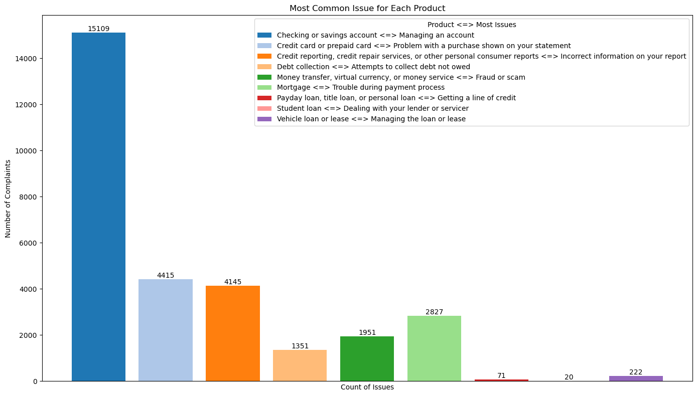
You can see each product with its problems. It is best to immediately find a solution that can reduce the number of complaints and improve quality. An example that can be taken is the product "Checking or savings account", a possible solution that could be offered to customers is to make instructions for managing the account properly or if the company uses a website or application that is related to this problem, then this website / application should have an easier interface.
Here we will identify how problems are solved and how often these solutions are used to solve a problem
file['Monetary Relief'] = (file['Company response to consumer'] == 'Closed with monetary relief').astype(int)
file['Explanation'] = (file['Company response to consumer'] == 'Closed with explanation').astype(int)
file['Non-Monetary Relief'] = (file['Company response to consumer'] == 'Closed with non-monetary relief').astype(int)

# Calculate the amount for each condition
result = pd.DataFrame({
'Monetary Relief': file['Monetary Relief'].sum(),
'Explanation': file['Explanation'].sum(),
'Non-Monetary Relief': file['Non-Monetary Relief'].sum()
}, index=[0])

dfmi = pd.DataFrame(result.values.reshape(1, -1), columns=pd.MultiIndex.from_product([['Monetary Relief', 'Explanation', 'Non-Monetary Relief']]))

# Visualizing data
if 'Total' in dfmi.columns:
    ax = dfmi.drop(columns=['Total']).plot(kind='bar', figsize=(10, 6))
else:
    ax = dfmi.plot(kind='bar', figsize=(10, 6))

for p in ax.patches:
    ax.annotate(str(p.get_height()), (p.get_x() + p.get_width() / 2., p.get_height()),
                ha='center', va='center', xytext=(0, 5), textcoords='offset points')

plt.title('Complaint Resolution Types')
plt.xlabel('Category')
plt.ylabel('Number of Complaints')
plt.xticks(rotation=0)  # Rotasi label sumbu x menjadi horizontal
plt.legend(title='Resolution Type')
plt.show()
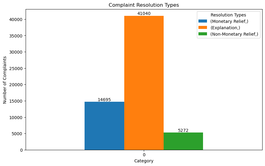
"Words trump all". that's the principle companies use to "appease" customers. With good explanations, all problems complained by customers can be resolved well.
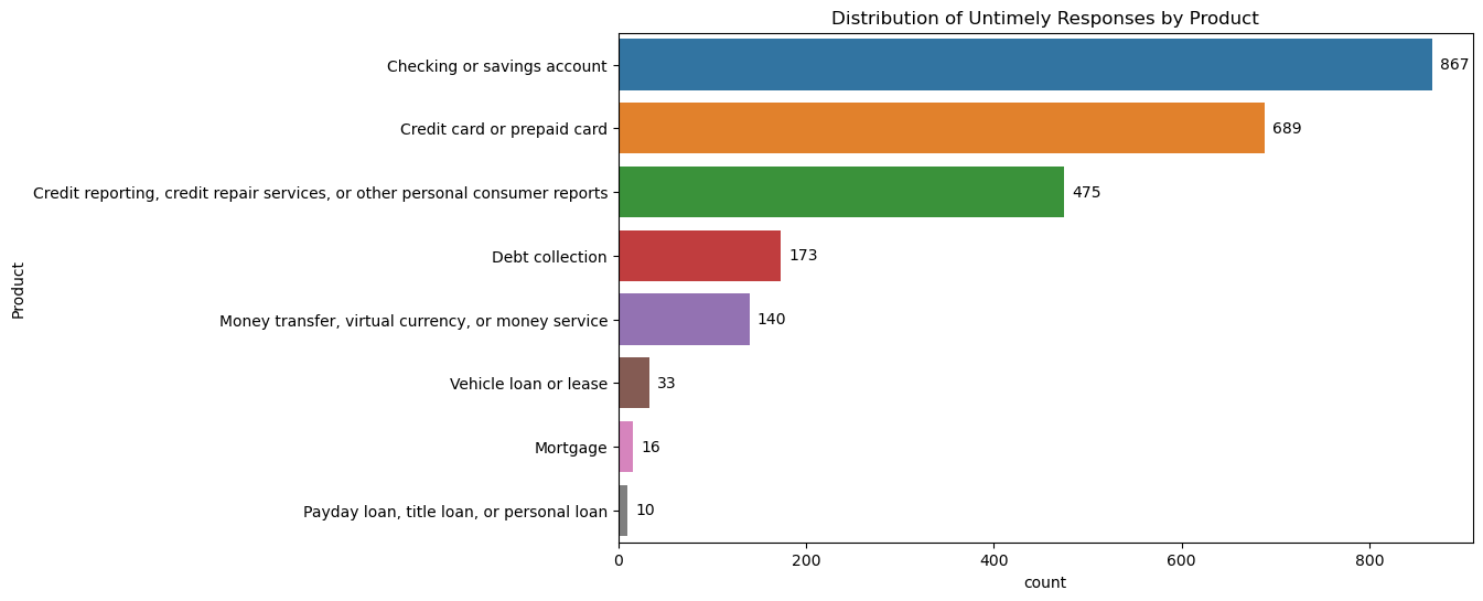
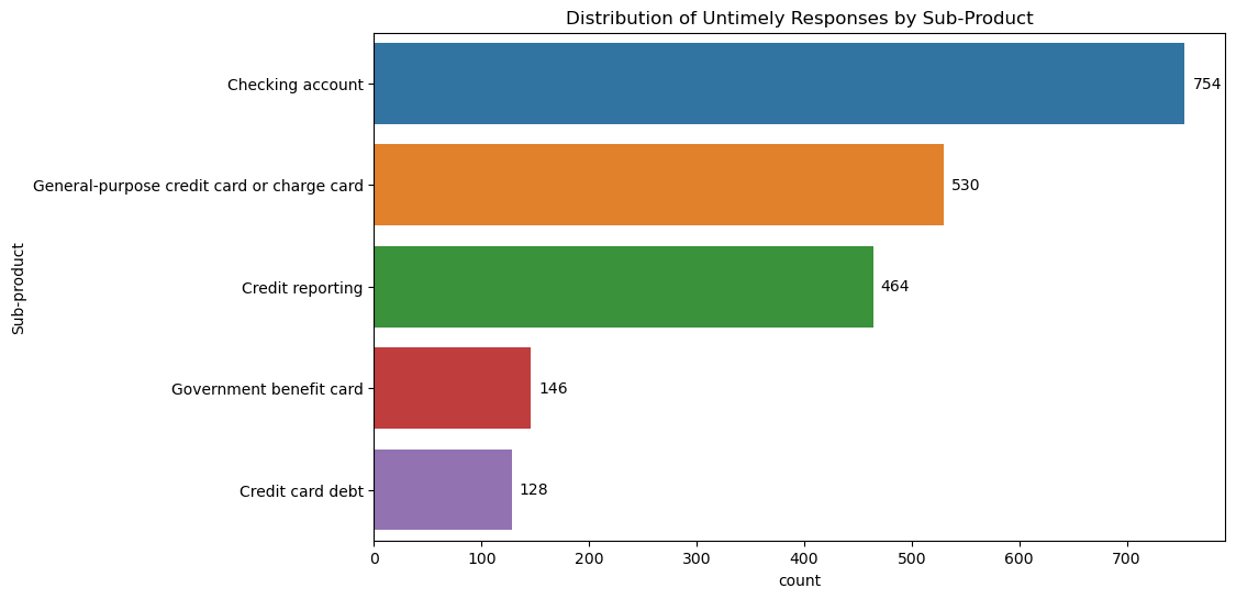
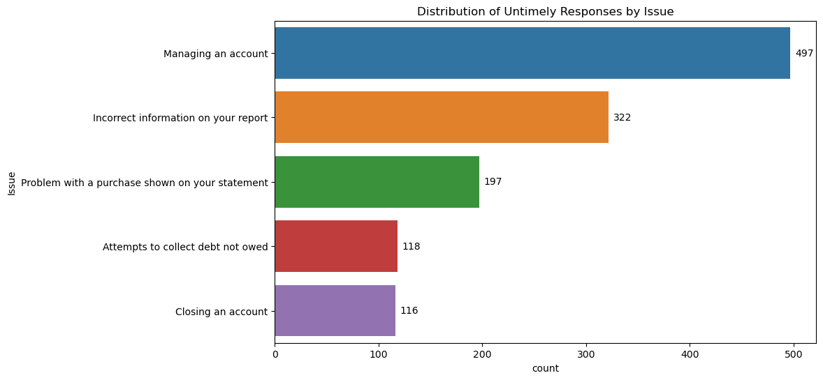
To answer this we need to look at complaints that are not responded to in a timely manner by also looking at aspects of the product, sub-product, problem and frequency of complaints and how long it takes for complaints to be responded to. Here I will display the top 5 from all categories
# Filter untimely complaints
untimely_responses = file[file['Timely response?'] == 'No']

# Descriptive analysis
product_distribution = untimely_responses['Product'].value_counts()
sub_product_distribution = untimely_responses['Sub-product'].value_counts().head()
issue_distribution = untimely_responses['Issue'].value_counts().head()
state_distribution = untimely_responses['State'].value_counts()

# Visualization with annotations
def add_annotations(barplot):
	for i in barplot.patches:
	barplot.annotate(format(i.get_width(), '.0f'),
	(i.get_width(), i.get_y() + i.get_height() / 2),
	ha='left', va='center',
	xytext=(5, 0),
	textcoords='offset points')

# Distribution of Untimely Responses by Product
plt.figure(figsize=(10, 6))
barplot = sns.countplot(data=untimely_responses, y='Product', order=product_distribution.index)
plt.title('Distribution of Untimely Responses by Product')
add_annotations(barplot)
plt.show()

# Distribution of Untimely Responses by Sub-Product
plt.figure(figsize=(10, 6))
barplot = sns.countplot(data=untimely_responses, y='Sub-product', order=sub_product_distribution.index)
plt.title('Distribution of Untimely Responses by Sub-Product')
add_annotations(barplot)
plt.show()

# Distribution of Untimely Responses by Issue
plt.figure(figsize=(10, 6))
barplot = sns.countplot(data=untimely_responses, y='Issue', order=issue_distribution.index)
plt.title('Distribution of Untimely Responses by Issue')
add_annotations(barplot)
plt.show()

# Time Analysis
untimely_responses['Date submitted'] = pd.to_datetime(untimely_responses['Date submitted'])
untimely_responses['Date received'] = pd.to_datetime(untimely_responses['Date received'])
untimely_responses['response_time'] = (untimely_responses['Date received'] - untimely_responses['Date submitted']).dt.days

# Visualization with annotations for response time histogram
plt.figure(figsize=(10, 6))
histplot = sns.histplot(untimely_responses['response_time'], bins=30, kde=False)
plt.title('Distribution of Response Time for Untimely Responses')
plt.xlabel('Response Time (days)')
plt.ylabel('Complain Frequency')

plt.show()
Product Analysis
Sub Product Analysis
Issues Analysis
Complain Frequency Analysis
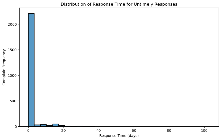
From all the data above, it can be said that customers need a user guide or interface that makes it easier for them. Apart from that, the system and human resources owned by the company need to be improved because there are still many errors which can be seen from the issue "Incorrect information on your report" which has quite a high value. Apart from that, efforts are made to stabilize the response time at 1-2 days because according to the data above, there are still complaints that are even answered more than 30 days later.
From the analysis above, we can conclude that:
1. Seasonal Patterns:
Around 4000 People with variable background were served 4 different Coffee
Learn more
Analysing sales opportunities from CRM
Learn more
Will be out soon !!!